10 Tips to Optimise Your Landing Page for Higher Conversions
Reading Time: 6 min
Why this guide and why now?
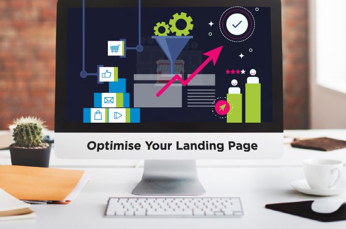
Quick truth: your ads win clicks; your landing page wins (or loses) revenue. And most pages still leak conversions because they’re unclear, slow, or trying to do 12 things at once. Users spend ~57% of viewing time above the fold, so your “first screen” either hooks or haemorrhages attention.
This isn’t a lecture; it’s a practical playbook. Below are 10 high-converting landing page tips we deploy for clients at Wisoft Solutions India—in a plainspoken voice, with proof, and exactly where to start. Sprinkle these into your roadmap and you’ll cover 80% of landing page optimisation in a week.
1) Start with message match (don’t bait-and-switch)
If your ad says “Free SEO Audit,” your page should deliver a Free SEO Audit—name, steps, timeline - front and centre. Even minor disconnects spike exits. Think of the click as a promise; keep it immediately, then ask for the lead. This is foundational to landing page best practices.
It’s also foundational to any high-performing paid campaign managed by a performance marketing team.
Try this: duplicate your top ad’s headline as your H1, then support it with a crisp, benefit-first subhead and a single action (CTA).
2) Win the “first screen”: headline, proof, CTA - tight and obvious
Above the fold, give people three things - why care, why trust, what next:
- Headline that states the outcome (“Cut onboarding time by 50%”)
- Two trust cues (logos, star ratings, a short quote)
- A single, high-contrast CTA
Users spend most time here; earn the scroll, don’t hope for it.
3) Design with visual hierarchy (lead the eye to the button)
Clutter kills decisions. Use size, weight, whitespace, and contrast to guide attention from headline → proof → CTA. Fewer colours. One primary action. If everything shouts, nothing speaks. This is one of those CRO strategies for landing pages that feels “design-y” but moves numbers.
Mini-check: Can a new visitor tell what to do in 3 seconds? If not, de-clutter.
4) Speak in benefits, then back it with logic
“Enterprise-grade platform” is jargon. “Reduce churn 15% with proactive nudges” is value. Lead with the outcome, then back it with specifics: a 40–60 word explainer, 3 bullets, and a proof point. Emotion first, logic second—always.
5) Trim your forms (and watch completion go up)
Every extra field adds friction. Studies show fewer fields → higher completion; removing just one field can deliver a notable lift. Multi-step forms and single-column layouts also help.
Do this today: ask for only email + first intent. Collect the nice-to-have data after the click (on the thank-you flow or by your SDR).
6) Load fast or lose them
As load time rises from 1s → 3s, bounce probability jumps ~32%. Google’s own guidance is clear: speed retains users and improves outcomes.
Quick fixes: compress images, lazy-load below-the-fold media, defer non-critical scripts. (If you need a shortlist, Wisoft will hand you a speed punch-list and implement it.)
7) Add a short video where it matters
Video lifts understanding (and dwell time): ~82–83% of marketers say video increased dwell time on their websites. Keep it under 90 seconds; place it near your core CTA.
Example: a 60-second “how it works” above the fold + a 2-minute product deep-dive lower on the page. That’s a high-converting landing page tip that pays rent.
8) Put real social proof near the moment of action
Ditch generic “featured on” carousels. Use named testimonials with photos, role/company, and a concrete outcome (“Cut reconciliation time from 5 days to 1”). If you can add a source link (G2, Google Review), do it. It’s trust on tap - and a staple of landing page best practices.
9) Make mobile a first-class citizen
Over half of the visits are mobile, and patience is thinner there. Keep tappable CTAs large, reduce form fields, and avoid heavy hero videos on 4G. This overlaps with speed: performance-first pages convert more, especially on mobile.
10) Test small, often, and with intent
Your first draft is the data’s opening bid. Run lightweight A/Bs on headlines, hero layouts, and CTAs before redesigning the entire page. Speed-focused changes often return quickest: case studies show tiny milliseconds can move conversion
Cadence tip: One controlled test every 2 weeks beats one giant overhaul every 2 quarters. That’s modern CRO strategies for landing pages in action.
Extra: a 7-section wireframe you can copy
- Hero (benefit + proof + CTA)
- Problem → stakes (speak their pain)
- Solution snapshot (1–2 visuals)
- Social proof (logos + 1–2 quotes)
- How it works (3 steps + micro-video)
- Pricing / next step (1 primary CTA)
- FAQ (objection busters)
This structure keeps you concise and scannable - core to landing page optimisation and AI-friendly summaries.
Where Wisoft Solutions India fits
Think of us as your “clarity and conversion” pit crew. We blend UX, analytics, and copy to implement landing page best practices end-to-end:
- Audit & plan: message match, hierarchy, speed, form friction
- Build & ship: copy, design, dev, tracking, and schema
- Learn & scale: disciplined testing, dashboards, and playbooks
Human CTA: if your page “looks nice” but sales can’t feel it, let’s fix that. We’ll review one landing page and reply with 3 tailored, high-impact changes - no obligation.
Book a 30-minute consult with Wisoft Solutions India
FAQs
Q1. What is landing page optimisation and where should I start?
Start with message match, a tight hero (benefit + proof + CTA), and speed. These three moves handle 70% of landing page optimisation wins. For deeper gains, add testing to your week, not your wishlist.
Q2. What are the essential landing page best practices for 2025?
Clear benefit headlines, real social proof, fast loads, short forms, and mobile-first layouts. Add a 60–90s explainer video if it clarifies value - watch your engagement climb.
Q3. Which CRO strategies for landing pages move the needle fastest?
Reduce form fields, speed up the hero, and A/B test headlines/CTAs. Tools and case studies show each of these can trigger meaningful lifts quickly.
Q4. Any high-converting landing page tips for the fold?
Yes: one benefit promise, one CTA, and two trust cues. Keep copy snackable and avoid clutter so visitors instantly know what to do next - then they’ll actually do it.
